Reusable components are super important in VueJS. It helps you save so much time and when done right, really makes your project more readable and maintainable.
In this tutorial, we’ll be making a custom tab component that allows any sort of content to be turned into a single page tab system.
This is what we’re going to be making!
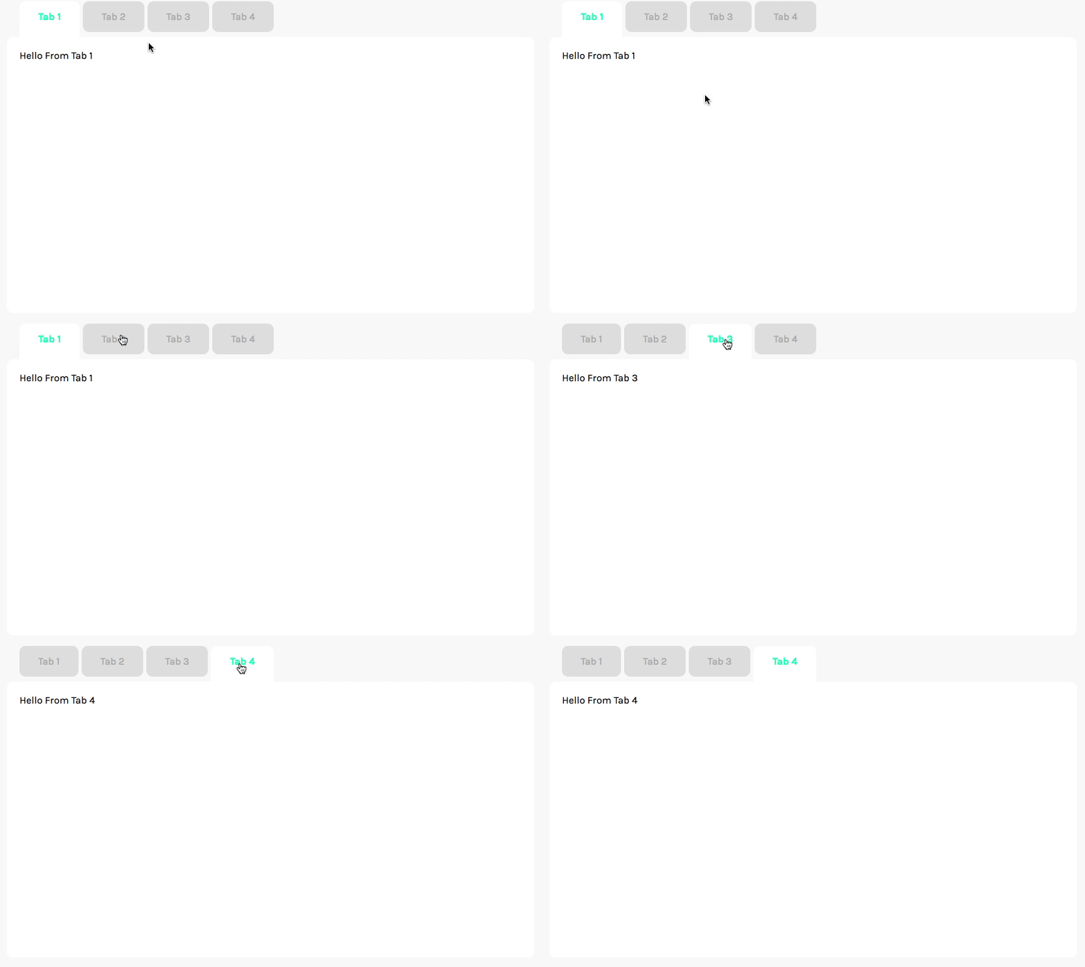
Hopefully, this tutorial gives you some insight into designing reusable components. Plus, you’ll get some useful Vue code too!
Disclaimer: this tutorial assumes you know a little bit about VueJS, if you would like to learn more of the basics, I’d suggest starting with some of my other tutorials.
Introduction to Reusable Components
One of the key phrases that developers love using is Don’t Repeat Yourself(DRY). In VueJS, there are lots of cases where reusable code is useful: a scroll functionality, a header component, or in our case, creating a tab system.
There are different ways to accomplish reusable code. A common method is using mixins to extract out your functionality and other is using slots to provide customization and flexibility.
For our tab system, we’re going to be using slots so that we can put any sort of content we want in each of our tabs.
Okay – let’s start coding.
Getting All Set Up
Our tab system is going to need just two components to work, and then another component to test out our new project. For functionality, we’ll need:
- Tab.vue – Each individual content tab that can be displayed
- Tabs.vue– Contains all of the tabs and handles displaying them.
The idea is pretty simple. The Tabs.vue component will be a wrapper that will contain a single slot. Then, when we create a Tabs element, we pass it several individual Tab.vue components for each different piece of content.
In order to make the example code as lightweight as possible, we used a global vue-cli to help build everything. So to run the actual project, first we need to install with npm install -g @vue/cli-service-globaland then we can just use vue serve src/Demo.vue to actually run the project.
Let’s just get the basic functionality down first and then we can make it a little bit fancier with more styles.
Get Notified When Courses Launch
The first batch of courses is scheduled to come out soon:
- Fullstack Nuxt (Supabase, Drizzle, TypeScript)
- Writing Better Vue Composables
- Building a Nuxt Content Site
Be the first to know when courses drop (and maybe even get early access) by joining the waitlist.
Setting Up a Reusable Tab Component
Tab.vue is the innermost component in our tab system, and it’s also one of the simplest to set up.
All we really want to do is get some identifying data (tab title) and depending on the value of a boolean, display some sort of content. We’ll pass the title as a component prop and store isActive as a data value so we can control it from another component.
To allow us to show any type of content in a Tab, we can use a slot.
This component is pretty straightforward so I’ll just show you the code.
To allow us to show any type of content in a Tab, we can use a slot.
<template lang="html">
  <div v-show="isActive">
    <slot></slot>
  </div>
</template>

<script>
  export default {
    props: {
      title: {
        type: String,
        default: 'Tab'
      }
    },
    data () {
      return {
        isActive: true
      }
    }
  }
</script>
One reason we are using v-show instead of v-if is to implement some of that keep-alive functionality that Vue has.
We’ll go back in later and add more customization options to this component, but this is good enough to get you started.
Setting Up the Tabs Wrapper Component
Now, let’s create some skeleton code for Tabs.vue to allow it to handle all sorts of tabs.
First, I think we should determine the JavaScript code for the component.
Let’s start off by defining our data options – we’re going to need an array of Tab.vue components and an index to track which tab is currently selected. That should look like this.
<script>
  export default {
    data () {
      return {
        selectedIndex: 0 // the index of the selected tab,
        tabs: [],        // all of the tabs
      }
    }
  }
</script>
Next, we should actually figure out how to load in the tabs. The way that this component is actually used with the slots will look something like this.
<!-- THIS IS JUST A SIMPLIFIED EXAMPLE. ITLL LOOK A LITTLE DIFFERENT -->
<tabs>
  <tab>Tab 1</tab>
  <tab>Tab 2</tab>
  <tab>Tab 3</tab>
  <tab>Tab 4</tab>
</tabs>
As you can see, each tab is a child of the Tabs.vue component – this means we can use some VueJS and normal JavaScript patterns to get all of the children.
This code is simple, and we can just throw it in the created lifecycle hook.
<script>
  export default {
    data () {
      return {
        selectedIndex: 0 // the index of the selected tab,
        tabs: [],        // all of the tabs
      }
    },
   created () {
      this.tabs = this.$children
   }
  }
</script>
Now, our tabs variable will have all a bunch of Vue component objects that we can iterate over.
The Tabs.vue component that will contain all of the individual tabs, but to make this as flexible as possible, we’ll use a slot so we can use any number of tabs down the line.
For now, our component code will look like this.
<template>
  <div>
    <ul class="tabs__header">
      <li v-for="tab in tabs" :key="tab.title">{{ tab.title }}</li>
    </ul>
    <slot></slot>
  </div>
</template>

<script>
  export default {
    data () {
      return {
        selectedIndex: 0, // the index of the selected tab,
        tabs: []         // all of the tabs
      }
    },
    created () {
      this.tabs = this.$children
    }
  }
</script>
Making a Demo Page
Next, we need some sort of component where we can test out our tabs component to see if everything is set up right.
So in our Demo.vuecomponent, we’ll have to import our Tab and Tabs components, and then create some example elements.
This is pretty straightforward; for this example, this is the code I used.
<template lang="html">
  <div>
    <tabs>
      <tab title="Tab 1">Hello From Tab 1</tab>
      <tab title="Tab 2">Hello From Tab 2</tab>
      <tab title="Tab 3">Hello From Tab 3</tab>
      <tab title="Tab 4">Hello From Tab 4</tab>
    </tabs>
  </div>
</template>

<script>
  import Tab from './Tab.vue'
  import Tabs from './Tabs.vue'

  export default {
    components: {
      Tab,
      Tabs
    }
  }
</script>
We now have all our components linked up! Let’s try it out. If you missed it earlier, make sure you install @vue/cli-service-global – then we can run it from the command line. Navigate to your project’s root folder and run vue serve src/Demo.vue
If you included the same content as me, you should see something like this.
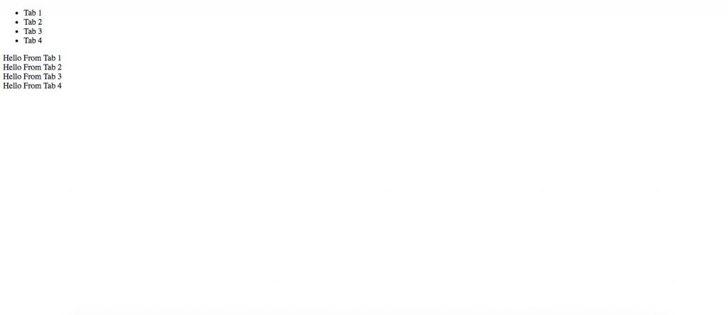
I know. It’s pretty basic right now and there’s no tab stuff at all, but don’t worry, we’re about to add all the functionality.
Adding the Tab Functionality
Now that we have all of the components we need set up and ready to go, let’s start working on actually adding the tab part.
This is actually pretty simple. We have to edit the Tabs.vue file. First, we’ll add a method to choose which tab is being displayed. Add the following JavaScript:
<script>
  mounted () {
      this.selectTab(0)
  },
  methods: {
      selectTab (i) {
        this.selectedIndex = i

        // loop over all the tabs
        this.tabs.forEach((tab, index) => {
          tab.isActive = (index === i)
        })
      }
   }
</script>
This makes it so that only one tab is visible at a time, and also makes it super easy to switch between tabs. Now, to control which tab is visible using the header, we can use VueJS click events.
We just have to change the header code to call our new method whenever one of the list items is clicked. Our new code should look like this.
<li v-for="(tab, index) in tabs" :key="tab.title" @click="selectTab(index)">
  {{ tab.title }}
</li>
Now, we should have a working tab system in which the content reacts to our clicks.
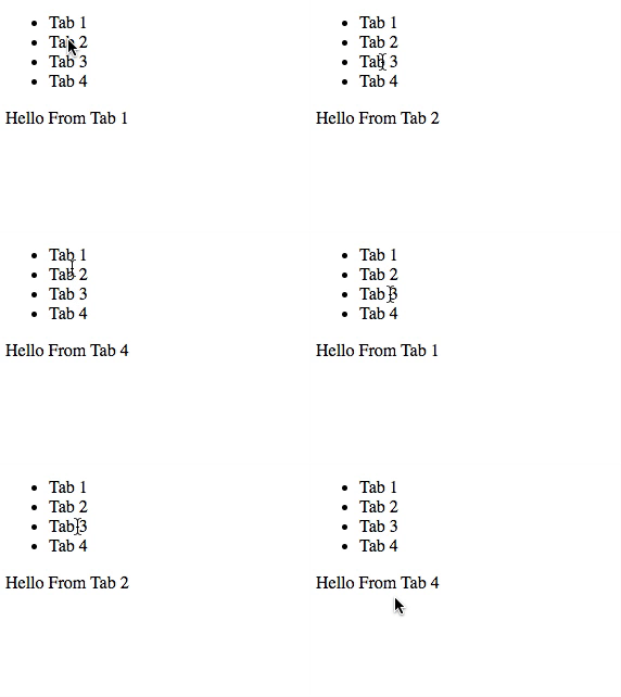
There! we have a working tab system!
Each tab can hold any sort of content: text, images, forms, or even other custom components. This flexibility makes the component extremely reusable. But obviously, it needs a visual upgrade.
Making It Look Better
Since the focus of this article is VueJS components and not a ton of CSS programming, I’m not going to detail on the CSS of this element. But you can always go to the repo for this tutorial and look around.
One thing I will explain a little bit is how I got the selected tab to display in a certain style. To do this we can use v-bind to the class attribute. In Vue, this takes an object, where we have the class name and a boolean to toggle the class.
For this case, we’ll have to edit the header in Tabs.vue and it looks like this…
<li
  v-for="(tab, index) in tabs"
  :key="tab.title"
  @click="selectTab(index)"
  :class='{"tabs__selected": (index == selectedIndex)}'
>
  {{ tab.title }}
</li>
This means that when the index is equal to the selected index (we are on the selected tab), the element will have the class .tabs__selected. This allows us to add some custom styles to the selected tab.
All in all, after spending a little bit of time to make it all pretty. This is what our tabs component looks like.
If you want yours to look like this, just copy the code from GitHub.

As you can see, it’s starting to look pretty legit. Now let’s add some more component props to make it super easy to use.
Adding More Customization
One super easy way to make it more customizable is to add a couple different styles that can be toggled by props. You can really add any sort of functionality you want: an icon spot, color variables, etc.
For now, I’ll show an example where we can use props to switch between multiple styles. In our case, we’ll have a light mode and a dark mode.
To do this, we’ll have to add a prop in our Tabs.vue file. Just add the following code to your export default.
<script>
  export default {
   props: {
    mode: {
     type: String,
     default: 'light'
    }
   }
  }
</script>
Then, we can add a class to the Tabs.vue root element using the same technique that we used to add our selected tab class. In this case, we’ll need to have two toggleable classes, one for light and one for dark. (and whatever other styles you want)
<div
  :class='{"tabs__light": mode === "light", "tabs__dark": mode === "dark"}'
></div>
Next, to add actually implement custom styles, we just need to adjust our existing CSS selectors and add some new ones to have element styles for each mode. Once again, just check out the repo for the final code.
Finally, we have to update Demo.vue to pass in a mode attribute to our component. For demo purposes, I made a button that toggles between the two styles. This is what the updated Demo component looks like
<template lang="html">
  <div class="wrapper">
    <button class="change__style" @click="changeStyle()">Change Style</button>
    <tabs :mode="mode">
      <tab title="Tab 1">Hello From Tab 1</tab>
      <tab title="Tab 2">Hello From Tab 2</tab>
      <tab title="Tab 3">Hello From Tab 3</tab>
      <tab title="Tab 4">Hello From Tab 4</tab>
    </tabs>
  </div>
</template>

<script>
  import Tab from './Tab.vue'
  import Tabs from './Tabs.vue'

  export default {
    components: {
      Tab,
      Tabs
    },
    data () {
      return {
        mode: 'dark'
      }
    },
    methods: {
      changeStyle () {
        if (this.mode === 'dark') {
          this.mode = 'light'
        } else {
          this.mode = 'dark'
        }
      }
    }
  }
</script>
Now, this is what our website looks like…
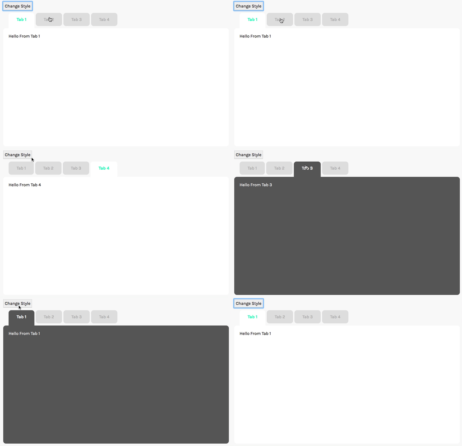
This is only the tip of the iceberg when it comes to adding custom props. It really depends on how you want to extend this tab system into your Vue project. Definitely just play around with it and see what’s possible!
Key Takeaways for Reusable Components
Hopefully you were able to learn a little bit about using slots to design reusable components.
It’s a great way to avoid having to repeat code and is also a super flexible way to include any sort of content you want.
Just remember that you should always plan out props/data and inheritance before starting to program. I know it’s tedious to do, but it will save you giant headaches when you forget what component has access to what data.
I hope to build this into a longer series where we build a variety of different reusable components. But in the meantime, happy coding!