Recently, I was working on a navigation menu, when I realized that I wanted a clean way to highlight the current page.
Usually, I’d just give an element a different color and call it a day, but this time I wanted to work with something animations.
I ended up building some neat active menu highlight logic using the Composition API and CSS styles.
I thought I’d share my solution – here’s what I ended up building.
Okay – let’s start coding it.
Creating our Menu
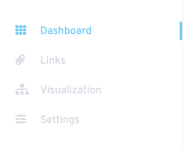
So the first thing we want to do is actually create our menu. We’ll use a <ul> element with four <li> elements inside.We’ll also give it some nice styles. This example also uses FontAwesome for some nice icons.
<script>
export default {}
</script>

<template>
  <div class="sidebar">
    <ul class="sidebar__nav">
      <li><i class="fas fa-th"></i>Dashboard</li>
      <li><i class="fas fa-paperclip"></i>Links</li>
      <li><i class="fas fa-sitemap"></i>Visualization</li>
      <li><i class="fas fa-sliders-h"></i>Settings</li>
    </ul>
  </div>
</template>

<style lang="scss" scoped>
.sidebar {
  height: 100vh;
  max-height: 100vh;
  overflow: hidden;
  position: relative;
  width: 300px;
  font-size: 1.2em;
  background-color: #fff;
  padding: 30px 0 0 30px;
  box-sizing: border-box;
  float: left;
}

ul.sidebar__nav {
  width: 100%;
  position: relative;

  li {
    margin-bottom: 10px;
    padding: 10px 0;
    font-size: 0.9em;
    color: #d2dae2;
    cursor: pointer;

    &.selected {
      color: #4bcffa;
    }

    i {
      width: 40px;
      color: inherit;
    }
  }
}
</style>
Then, we want to set up a reactive data property that represents the current page. So using the Composition API, we want to declare that in our setup method.
<script>
import { ref } from 'vue'
export default {
  setup() {
    const selected = ref(0) // index of the selected el

    return {
      selected,
    }
  },
}
</script>
Next, we want to create a method that can change our currentPage variable.
export default { setup() { const selected = ref(0); // index of the selected el
const changeSelected = (i) => { selected.value = i; }; return { changeSelected,
selected, }; }, };
Back in our template, we want to add two things.
- A click listener that calls our
changePagemethod - A dynamic class binding that allows us to style our selected page
<li
   :class=' { "selected": selected === 0 } '
   @click='changeSelected(0)'
>
   <i class='fas fa-th'></i>
   Dashboard
</li>
 <li
   :class=' { "selected": selected === 1 } '
   @click='changeSelected(1)'
>
   i class='fas fa-paperclip'></i>
   Links
</li>
<!-- continue for the rest -->
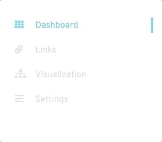
Now, at this point, let’s check out what we have.
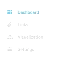
Much better, now let’s actually make our active menu highlighter.
Creating our active menu highlight
The first thing we want to do is actually build our highlight div and position it.
In our template, we want to insert it inside our navigation after all the
<ul>
  <!-- after all the <li> -->
  <div class="select-highlight" />
</ul>
Then, inside our style, we want to give it a
position: absolute and align it to the right side. We also want to set its size, color, and most importantly give it a transition for its top property.This will actually handle the smooth slide animation that we are looking for.
.select-highlight {
  position: absolute;
  right: 0;
  top: 5px;
  height: 30px;
  width: 4px;
  background-color: #4bcffa;
  transition: 0.1s top ease-out;
}
This is what it should look like.
Get Notified When Courses Launch
The first batch of courses is scheduled to come out soon:
- Fullstack Nuxt (Supabase, Drizzle, TypeScript)
- Writing Better Vue Composables
- Building a Nuxt Content Site
Be the first to know when courses drop (and maybe even get early access) by joining the waitlist.
Animating our active menu highlight
To actually make our highlight move depending on the selected element, we want to head back to our
changePage method and add the following code that accesses our highlight and changes its top position.In our example, each element is 50 pixels high so that’s why that is the factor we’re using, but it might be different in your projects.
const changeSelected = (i) => {
  selected.value = i
  document.getElementsByClassName('select-highlight')[0].style.top =
    `${i * 50 + 5  }px`
}
Thanks to the transition we gave our highlight, the element will smoothly move between the old and new top positions.
All done
And we’re all done. There are tons of use cases for some nice little UI. For example, it could be useful for pagination, navigation menus, hover effects, and so much more.
You could also implement the animation with CSS keyframes and animation properties and simply modify values and trigger the animation whenever our selected element changes.
Let me know the cool ways that you are able to implement it into your Vue projects!
I hope you found this quick Daily Vue tip helpful and can think of ways to use this technique in your code.
Happy coding!