Well designed inputs are a great way to boostthe conversion rate of your forms. They can make your site appear more professional, trustworthy, and will allow visitors to complete forms quicker.
In this tutorial, we’ll be building a basic DatePicker component that you can easily style and tweak to match your own project. It will use <select> elements to model data and emit events to a parent component.
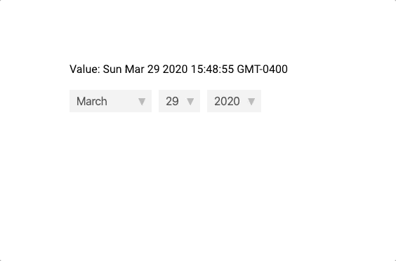
Here’s a quick look at what we’ll be making.
Alright, enough introduction – let’s jump straight into building it.
How We’re Going to Do It
First, let’s look at what’s happening at a high level.
Inside our DatePicker.vue component, we’re going to have 3 select elements – one each for the month, date, and year.
Then, to make handling dates so much easier we’re going to be using the moment.js library. One really useful thing that this allows us to do is display the appropriate number of days in our date select element.
Since months can have different number of days, we have to change our date select element depending on the currently chosen month.
To model our data, all of our select elements will change the value of a single moment object, and whenever the value changes, we want to emit an event to our parent component.
Creating our Basic <select> Elements
Okay – let’s start off by building the easier of the select elements – the month and the year.
Inside our setup method, we want to create a few pieces of data. If you don’t know how the setup method works in the new Composition API, here’s our beginner’s tutorial.
We’ll create three properties: a months array, a beginning year, and a number of years. They don’t have to be reactive – they just have to be accessible in the template.
So our setup method will look a little like this.
import { onMounted, ref } from 'vue'

export default {
  setup(props, context) {
    const months = [
      'January',
      'February',
      'March',
      'April',
      'May',
      'June',
      'July',
      'August',
      'September',
      'October',
      'November',
      'December',
    ]

    const startingYear = 2010
    const numberofYears = 20

    return {
      months,
      numberofYears,
      startingYear,
    }
  },
}
Then, inside our template we can use v-for loops to iterate over this data and create our select elements. The reason we’re wrapping them in a div is so that styling them is a little bit easier.
<template>
  <div class="date-picker">
    <div class="custom-select">
      <select>
        <option v-for="(month, index) in months" :key="month" :value="index">
          {{ month }}
        </option>
      </select>
    </div>
    <div class="custom-select">
      <select>
        <option
          v-for="i in numberofYears"
          :key="i"
          :value="startingYear + (i - 1)"
        >
          {{ startingYear + (i - 1) }}
        </option>
      </select>
    </div>
  </div>
</template>
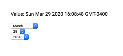
Our app should look like this right now.
 Let’s make this a little prettier and add the following CSS styles. Styling select elements is a little tricky so we’re going to overwrite them by using a wrapper
 <div>.
<style scoped>
/* wrapper-div for including arrow */
.custom-select {
  background-color: #eee;
  float: left;
  margin-right: 10px;
  position: relative;
}

.custom-select select {
  -moz-appearance: none;
  -webkit-appearance: none;
  appearance: none; /* remove default styling */
  background-color: inherit;
  border: none;
  color: #333;
  display: block;
  font-size: 16px;
  height: 32px;
  padding: 5px 30px 5px 10px;
  margin: 0;
  outline: none;
}

/* drop arrow */
.custom-select:after {
  content: '\25bc';
  color: #aaa;
  font-size: 12px;
  position: absolute;
  right: 8px;
  top: 10px;
}
</style>
Now here’s our current app with our new styles.
Get Notified When Courses Launch
The first batch of courses is scheduled to come out soon:
- Fullstack Nuxt (Supabase, Drizzle, TypeScript)
- Writing Better Vue Composables
- Building a Nuxt Content Site
Be the first to know when courses drop (and maybe even get early access) by joining the waitlist.
Building our Date <select> Element
With the static select elements out of the way, let’s work on our select element. Like I was saying earlier, the options available depend on the value of our select element.
So the first thing we have to do is create a Moment object that will represent the current value of our DatePicker – we’ll call it dateValue.
Let’s first import moment by saying npm i moment and then we can use it inside our component like this.
import moment from 'moment'

export default {
  setup(props, context) {
    const dateValue = moment() // defaults to current date

    // ....
  },
}
Then, since we are using Moment, there’s a neat built in method called daysInMonth()that returns the number of days in our object’s current month. So we’ll create a reactive piece of data and set it equal to this value.
const daysInMonth = ref(dateValue.daysInMonth())

// ...

return {
  daysInMonth,
  // ...
}
Now, we can use this value inside our component in another v-for loop.
<div class="custom-select">
  <select>
    <option v-for="i in daysInMonth" :key="i" :value="i">{{ i }}</option>
  </select>
</div>
We have all three of our elements up. However, we’re still not changing our values, we’re simply able to edit our selects. In the next section, we’re going to actual start editing our value property.
Modeling Data
The first thing we want to do is create a method that allows us to edit our Moment object. We’ll call it editValue and it will take two values:
- A string representing the current unit we are editing (month, date, year)
- Our event object that we can use to get the value of the select
Then, all we have to do is call the moment.set(unit, value)method and update our daysInMonth value.
const editValue = (unit, evt) => {
  dateValue.set(unit, evt.target.value)
  daysInMonth.value = dateValue.daysInMonth()
}

// ...

return {
  editValue, // add editValue to everything we're returning
  // ...
}
Now, whenever one of our select changes we want to be able to call this method and pass it on the proper arguments.
<select @change='editValue("months", $event)'>
  <!-- ... -->
  <select @change='editValue("date", $event)'>
    <!-- ... -->
    <select @change='editValue("year", $event)'>
      <!-- ... -->
    </select>
  </select>
</select>
Now, whenever we change our month, the number of days should reflect our choice.
Updating our Display
If you notice, our dateValue property starts off being the current date, but the original value of our select elements don’t reflect this. So to change this, we’re going to have to write a method that changes the value of our select elements.
We can do this using template refs.
To make a template ref in Vue 3, we can declare them in our script by using the new ref method that Vue exposes.
const month = ref(null)
const date = ref(null)
const year = ref(null)

// ...

return {
  month,
  date,
  year,
  // ...
}
Then, inside our component, we can declare refs the same way we used to.
<select @change='editValue("months", $event)' ref="month">
  <!-- ... -->
  <select @change='editValue("date", $event)' ref="date">
    <!-- ... -->
    <select @change='editValue("year", $event)' ref="year">
      <!-- ... -->
    </select>
  </select>
</select>
Let’s write a method that updates these refs based on our dateValue. It will use moment methods to help format our date. You have to make sure to return the refs from our setup method so they are available in the template.
const updateElements = () => {
  // month.value gives us the <select>
  month.value.value = dateValue.month()
  date.value.value = dateValue.date()
  year.value.value = dateValue.format('YYYY')
}
In order to change the starting value of our components, we have to call this method during the onMounted event hook. This is because our setup() method is called before the DOM is mounted, so all of our template refs will be null until the onMounted event.
We’ll also want to call this method whenever our editValue method runs.
The code will look like this.
const editValue = (unit, evt) => {
  dateValue.set(unit, evt.target.value)
  daysInMonth.value = dateValue.daysInMonth()
  updateElements()
}

onMounted(() => {
  updateElements()
})
Now, if we start up our app, you’ll see that the starting value is indeed the current date.
How to Use Our DatePicker Component
Now that we have our DatePicker component working – let’s check out how to include it inside a parent component.
First, we’re going to have to emit a method whenever our value changes.
If you don’t know, in Vue 3, we can access the emit method by using the setup method’s second argument – context.
So our editEvent method should now look like this.
const editValue = (unit, evt) => {
  dateValue.set(unit, evt.target.value)
  daysInMonth.value = dateValue.daysInMonth()
  updateElements()
  context.emit('update', dateValue)
}
Then, inside another component – we can just listen to our updateVal event and handle the data however we want.
<div id="root">
  <p>Value: {{ date }}</p>
  <date-picker @update="date = $event" />
</div>
There ya have it
This is only really the tip of the iceberg when it comes to building a DatePicker component.
There are tons of great extensions you could add to this project like:
- Passing default values via props
- Adding a popup calendar to select a date
- Add better stylings to the components
- Write custom validations for Vuelidate
Hopefully, this tutorial was helpful in working with data inside the Composition API. If you have any questions, just let me know in the comments down below and I’ll try to help out.
Cheers!