A parallax scrolling effect is a beautiful way to add depth to your designs and to really make your site stand out.
Recently, I was inspired by this Webflow example of parallax scrolling, and wanted to implement something similar in Vue.
This is what I came up with.
By the end of this tutorial, you’ll know how to set up this parallax scrolling effect in Vue, and be well on your way to implementing this in your own projects with your own images.
Coding time!
How our Vue parallax scrolling effect will work
Let’s first go over what exactly a parallax scrolling effect means and how we’re going to implement it in Vue 3.
Parallax scrolling is when your background elements move at a different speed than your foreground elements – creating a sense of depth on the screen.
To do this in Vue, we’re going to give our elements two background images that will zoom in as the user scrolls down the page. We’ll also add two different page sections that will fade in as the user scrolls so you can see other ways to implement what we’re doing.
We’re going to be listening to some scroll events and using the scroll position and the position of our elements to determine which elements are visible and what styles they should have.
It’ll make a lot more sense once we start coding, so let’s just get right to it.
Creating our template
Here’s the code that we want inside of our component’s template.
vue
<template>
  <div class="root">
    <img class="background" ref="background" src="../assets/tree-1.jpg" />
    <img
      class="foreground"
      ref="foreground"
      src="../assets/tree-foreground.png"
    />
    <div class="section section-1" ref="first">
      <div>
        <h1>Parallax Made Easy.</h1>
      </div>
    </div>
    <div class="section section-2" ref="second">
      <div>
        <h2>Here's more info</h2>
        <p>Lorem ipsum dolor, sit amet consectetur adipisicing elit...</p>
      </div>
    </div>
  </div>
</template>
As you can see, we have…
- A root element that wraps our parallax section
- 2 img elements – foreground and background
- 2 different sections of content – contains the text
Another important thing to note is that we gave many of our elements a template ref so that we can easily access it inside our script.
These are the two images that we will be using.
Background (Credit: Unsplash)

Foreground (Credit: Creative Plannet)

Styling our components
This is where the magic begins.
First, let’s style our images. We want them to be fixed and take up the whole screen – so it takes a little bit of tweaking to get them exactly the sizes we want.
This may also be different for your pictures, just try to get them to a place where you think they look good.
css
img.background,
img.foreground {
  /* Fill background */
  min-height: 100%;
  min-width: 1024px;

  /* Scale proportionately */
  width: 100%;
  height: auto;
}

img.background {
  /* Positioning */
  position: fixed;
  top: 0;
  left: 0;
}
Now, we want to do is style our section class – and we want to make sure that each section is at least the size of our window.
css
.section {
  min-height: 100vh;
  position: relative;
}
Next, we can style the content of each sections. We want them to be positioned on top of each other using a position: fixed and centered using some transforms.
Then, the way we’re going to control the visibility is by changing the opacity, so let’s set the second section to have an opacity: 0 by default.
The rest is pretty self-explanatory and were just the properties that I thought made our component look the best, but feel free to change anything of course.
css
.section > div {
position: fixed;
color: white;
/* centers this div */
left: 50%;
top: 50%;
transform: translate(-50%, -50%);
}
.section-1 {
margin-bottom: 500px; /* determines the gap between our two sections */
font-size: 4em;
}
.section-2 {
opacity: 0; /* defaults to 0 because it's not visible */
}
.section-2 div {
background-color: rgba(255, 255, 255, 0.7);
color: black;
text-align: center;
padding: 50px;
max-width: 300px;
}
.section-2 h2 {
font-size: 2em;
margin-bottom: 40px;
}
.section-2 p {
line-height: 150%;
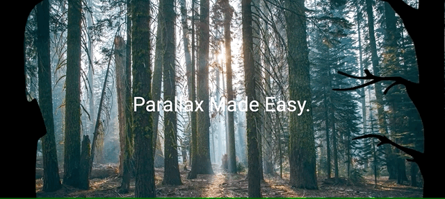
}Now at this point, this is what we should see.

Our page looks put together, but if we scroll nothing happens and our Section #2 never becomes visible.
That’s because we don’t actually have any parallax logic, so let’s work on that right now.
Adding the parallax effect
We’re going to be implementing our logic using the Vue 3 Composition API, so the first thing we want to do is import a few things from vue.Also, inside our setup method, we want to access our template refs.
vue
<script>
import { ref, onMounted, onUnmounted } from 'vue'
export default {
  setup() {
    const foreground = ref(null)
    const background = ref(null)
    const first = ref(null)
    const second = ref(null)

    return {
      foreground,
      background,
      first,
      second,
    }
  },
}
</script>
Now, we want to add and remove our scroll event listener whenever our component is mounted or unmounted lifecycle hooks, respectively.
js
onMounted(() => {
  document.addEventListener('scroll', handleScroll)
})

onUnmounted(() => {
  document.removeEventListener('scroll', handleScroll)
})
Finally, let’s get to the cool part our event handler method – which we called handleScroll. Depending on our scroll value, there are four things we want to change
Opacity of our first sectionOpacity of our second sectionZoom of our foregroundZoom of our background
Here’s what the code could look like.
js
const handleScroll = (evt) => {
  const scrollY = window.scrollY
  // decreases as user scrolls
  first.value.style.opacity =
    (100 - (scrollY + window.innerHeight - first.value.offsetHeight)) / 100
  // increases as user scrolls
  second.value.style.opacity =
    (scrollY + window.innerHeight - second.value.offsetTop) / 100

  const maxBackgroundSize = 120
  const backgroundSize = scrollY / (maxBackgroundSize - 100) // increases as user scrolls

  // zoom the background at a slower rate
  background.value.style.transform =
    'scale(' + (100 + backgroundSize * 0.4) / 100 + ')'
  foreground.value.style.transform =
    'scale(' + (100 + backgroundSize) / 100 + ')'
}
And that’s it for our parallax effect, here’s what our app should look like as we scroll down.
There’s so many different extensions you could add on this project – more sections, more layers, different effects. As long as you understand how to make your styles respond to the scroll position, the possibilities are endless.
It will take some extra effort to get it exactly how you want it for example some style or variable values are going to be specific to your images and getting it looking great for different windows may take some additional work.
But for now, we have what we’re looking for!
And there ya go
There are so many other uses for a parallax scrolling effect – it’s truly a creative way to style your web app and I want to see what you come up with!
I hope that this gave you some ideas to work with and as always, if you have any questions, just leave a reply!
Happy coding!